User Research, Interviews, Qualitative Analysis, Affinity Mapping, Persona, Comparative Analysis, Wireframing, UI Design, Hi-fidelity Prototyping, Usability Testing
Note: This project is a proof of concept to facilitate user research and buy-in.
Research, Strategy, Design
Figma, Google Forms
4 weeks
Hadi Muhsin
Terri Lim
In between heartfelt conversations with six expatriate and local mothers who were pregnant in the past year, we learnt that they are more concerned for their baby than themselves and did little to address negative moods during pregnancy.
It is trying for first-time mothers who struggle to cope with pregnancy changes, thus succumbing to anxiety. Experienced mothers are more prepared to manage their well-being in subsequent pregnancies.
The vast online resources may paint a perfect picture of motherhood that is hard to achieve or offer conflicting views. It may overwhelm and trigger unnecessary stress for mothers.
Many turn to their partners, family and friends to wade through periods of low moods. They feel supported when paediatricians are attentive and emphatic to them. Connecting with mothers alike also helps.
We investigated the apps which mothers may use during pregnancy. It includes wellness trackers, pregnancy apps and meditation apps. We studied them to find out how to serve the needs of mothers more comprehensively.
Delivery due date, moods and symptoms tracking can suggest guides to address pregnancy discomforts and alert specialist intervention if needed.
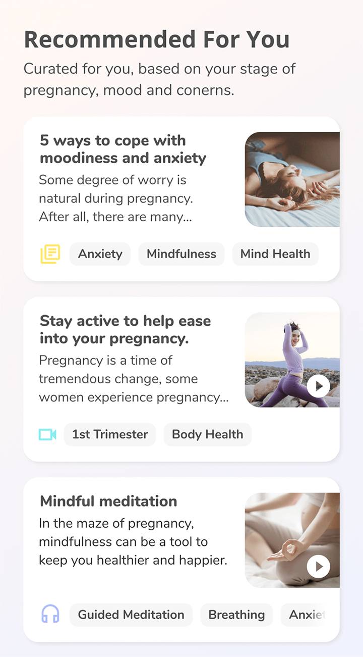
Depending on user inputs, the app can tailor content — video, audio and articles — that is informative but not overwhelming.
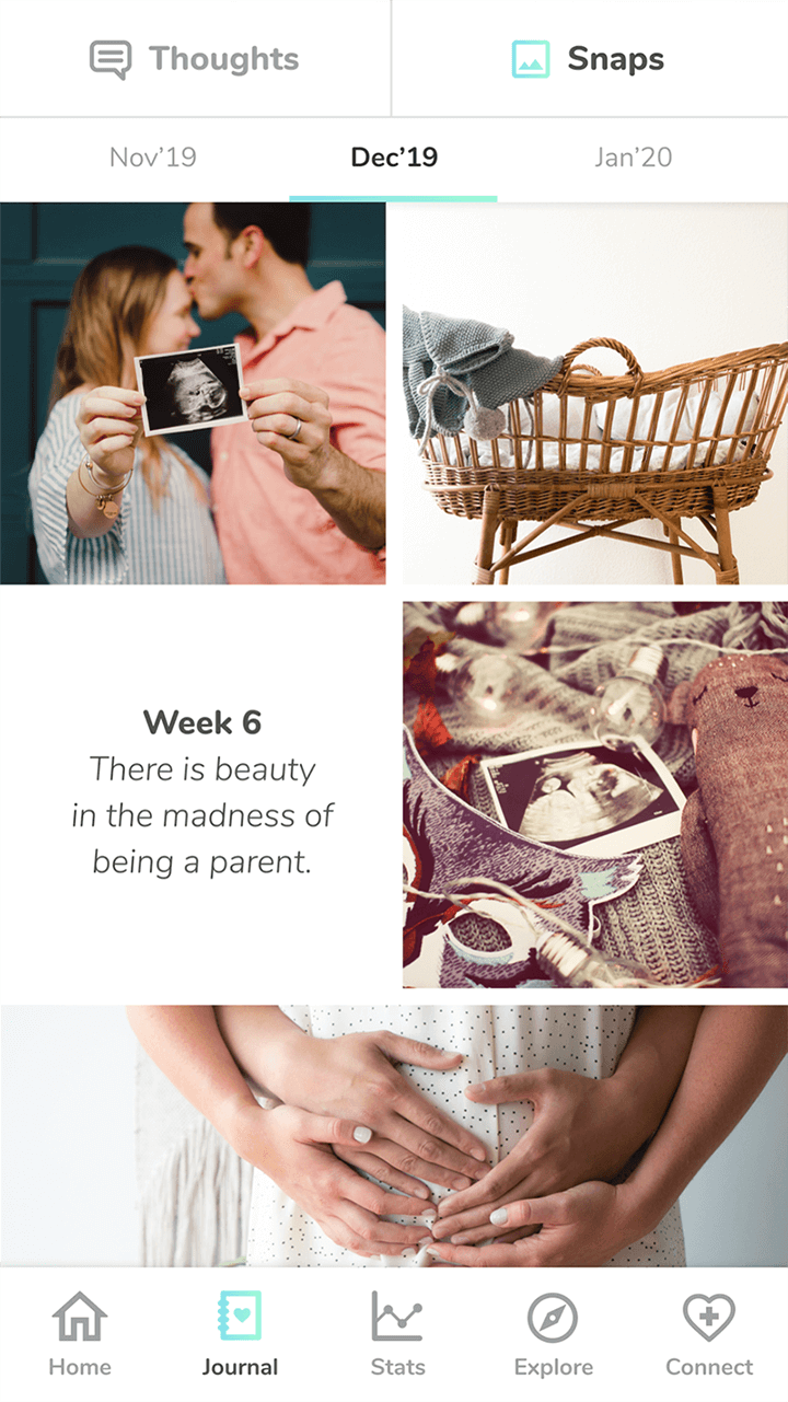
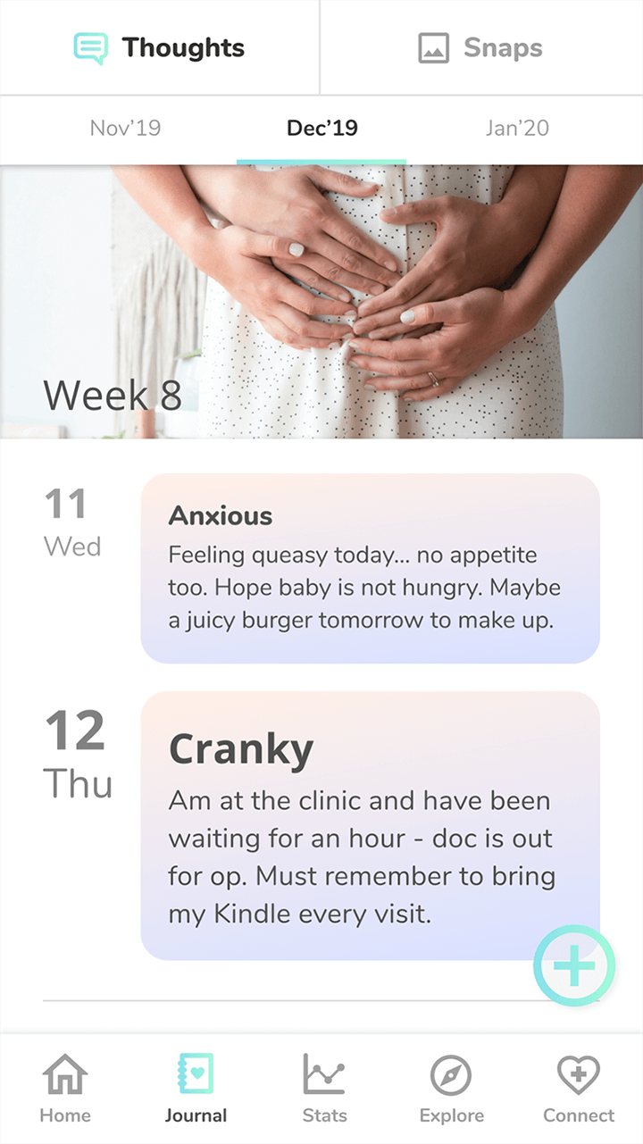
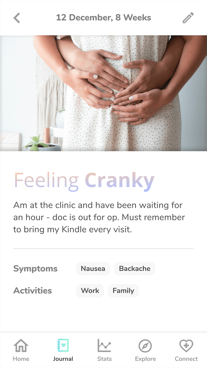
A mother can track observations and photos in a journal. The records of her pregnancy journey can motivate her to monitor her well-being diligently.
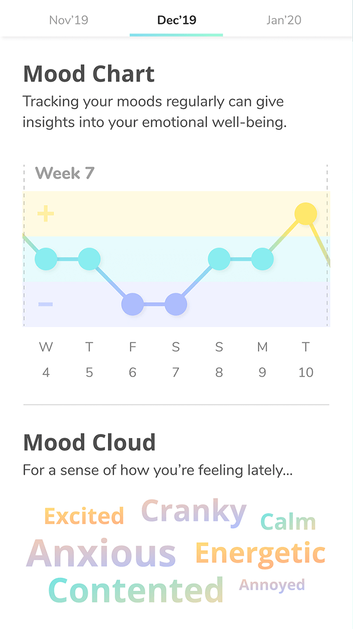
The records of moods and symptoms provide statistical insights over time, supporting a mother to take note of her well-being.
If the app records prolonged periods of poor moods and symptoms, it will guide her to helplines for professional support.
The look and feel of the prototype would make or break the first impressions of our app. As the brief concerns how the product makes mothers feel, we needed a refined prototype to get valuable feedback.
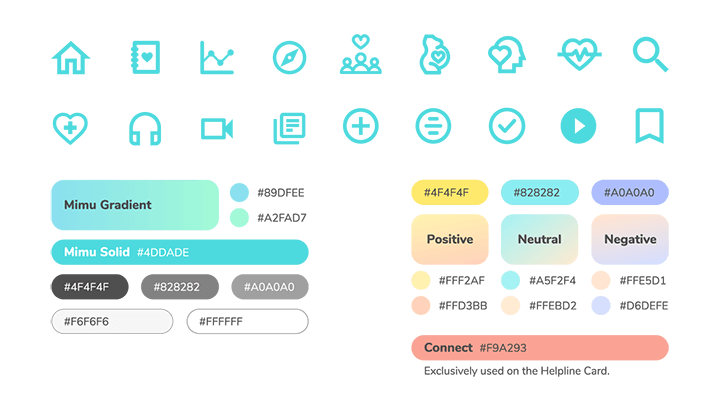
We surveyed mothers to understand how they feel about different colours to develop a colour palette — testing it exhaustively to ensure that it matches the moods in the app.
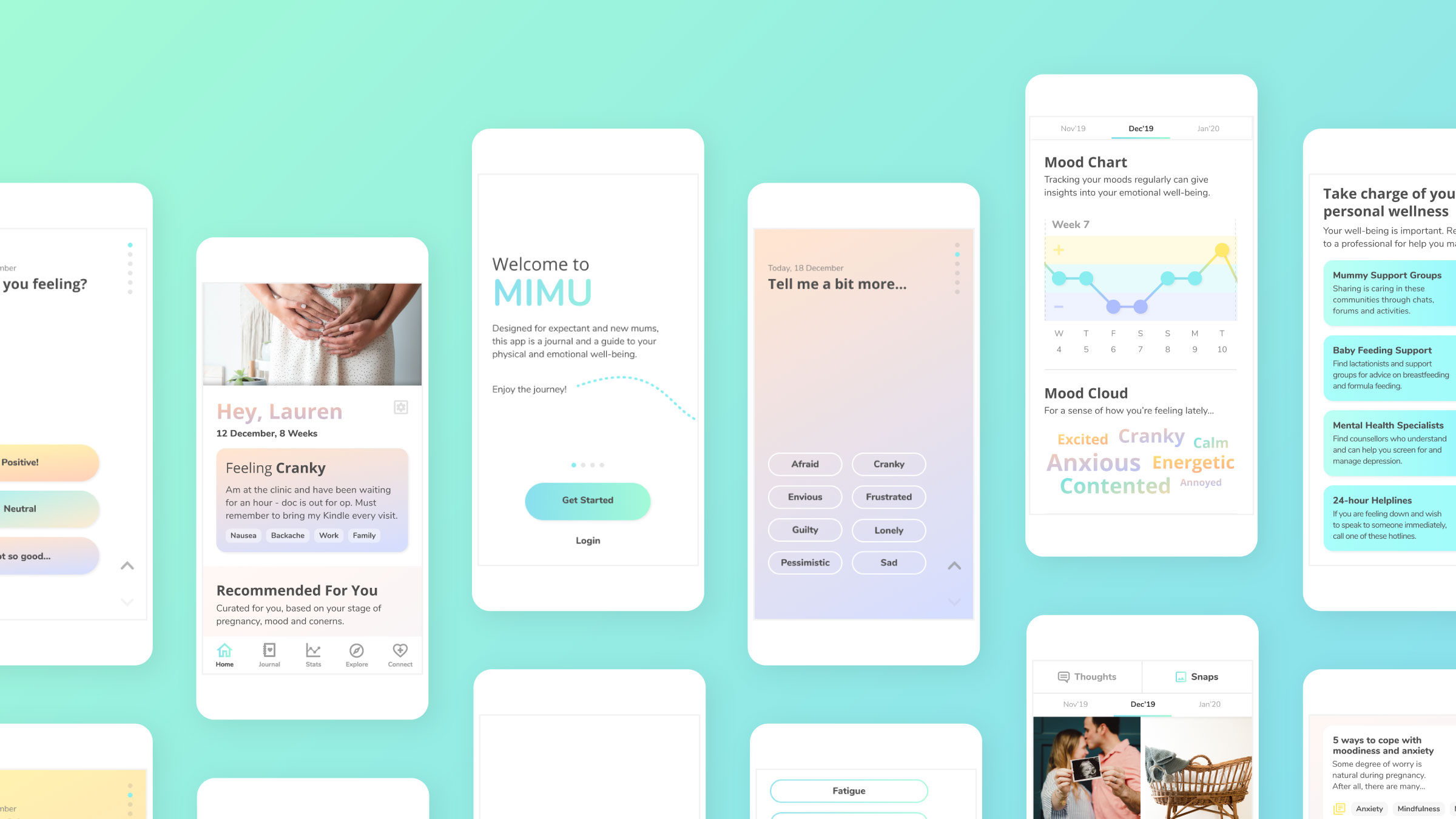
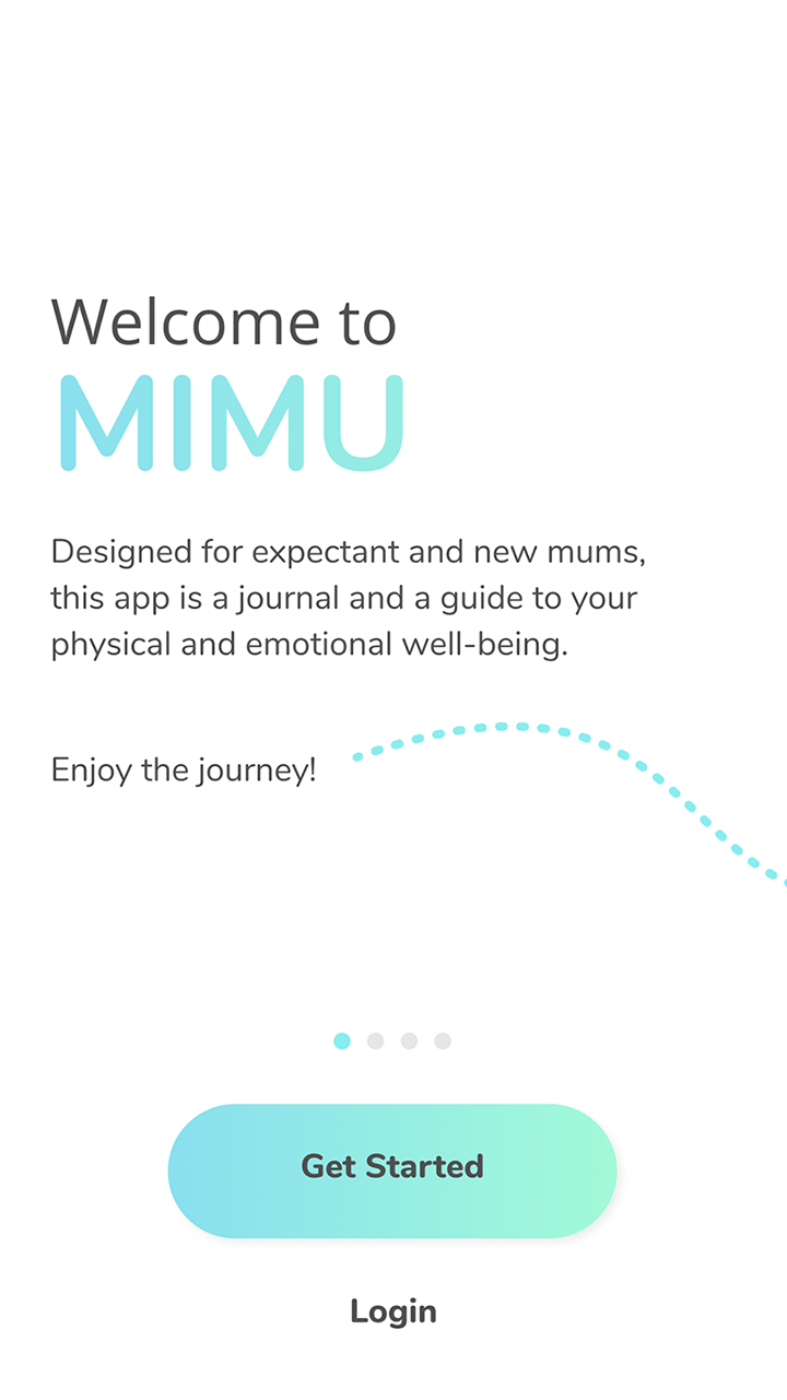
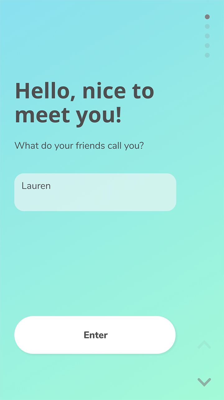
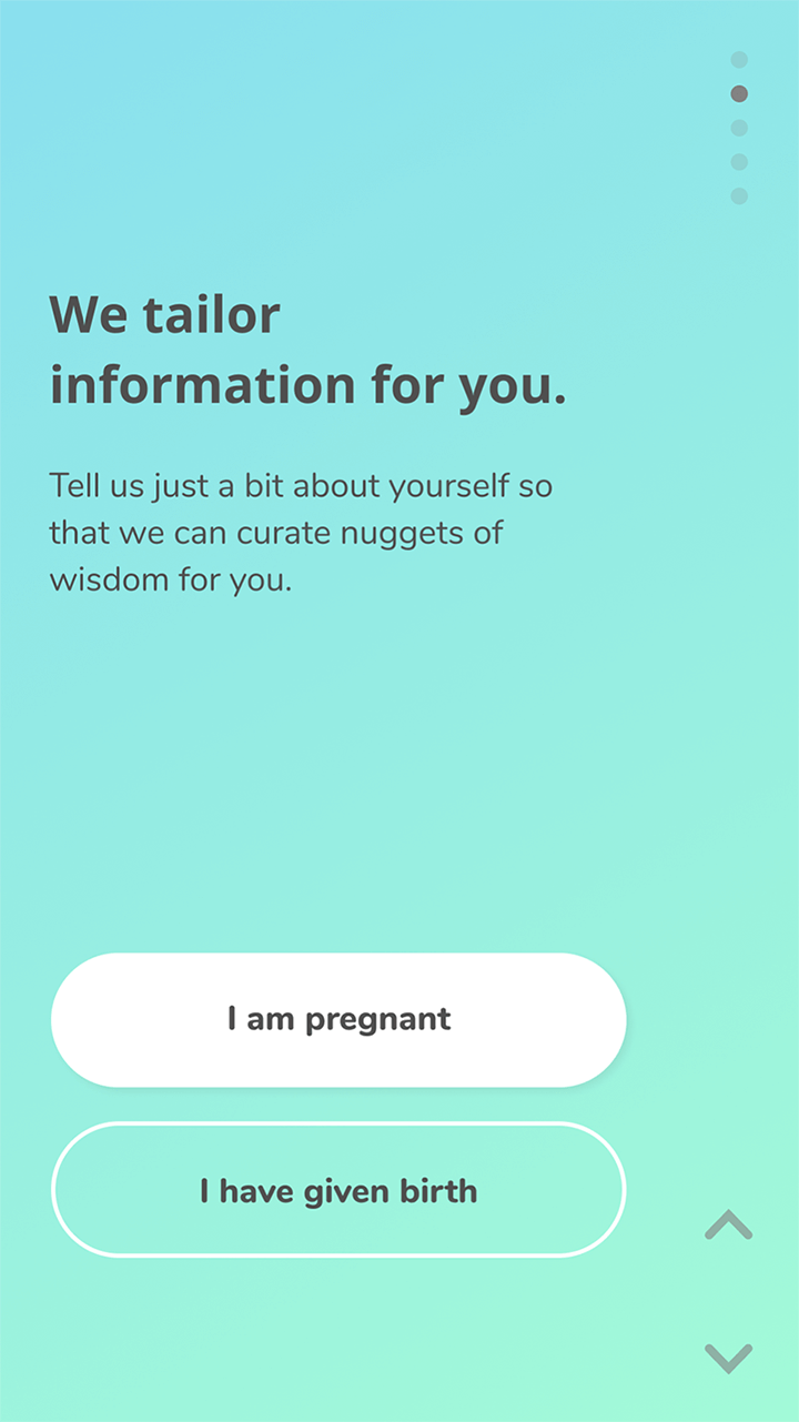
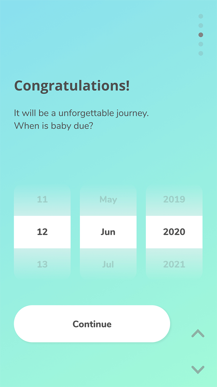
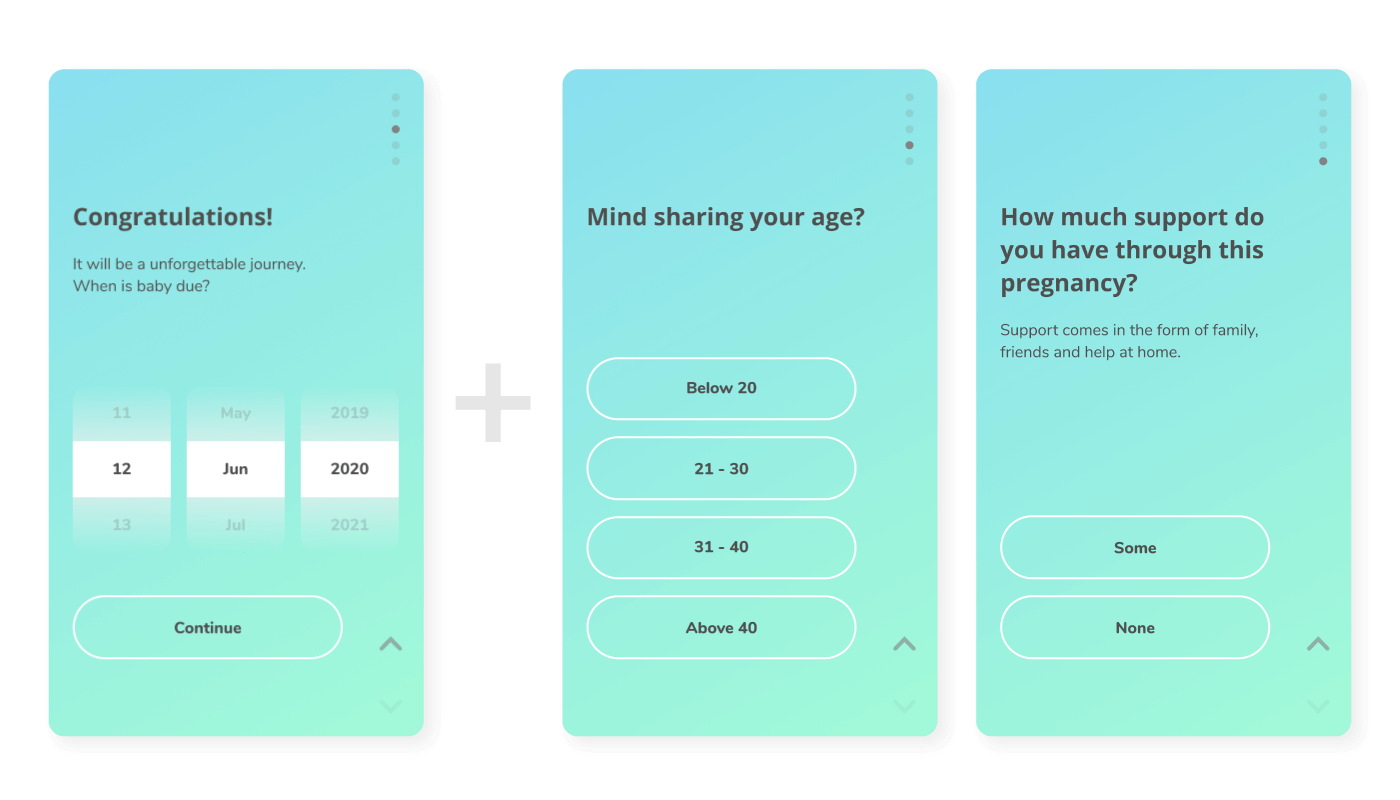
Our solution is a first of its kind with tracking, browsing and journalling in one. We designed a thorough onboarding to acquaint users swiftly.
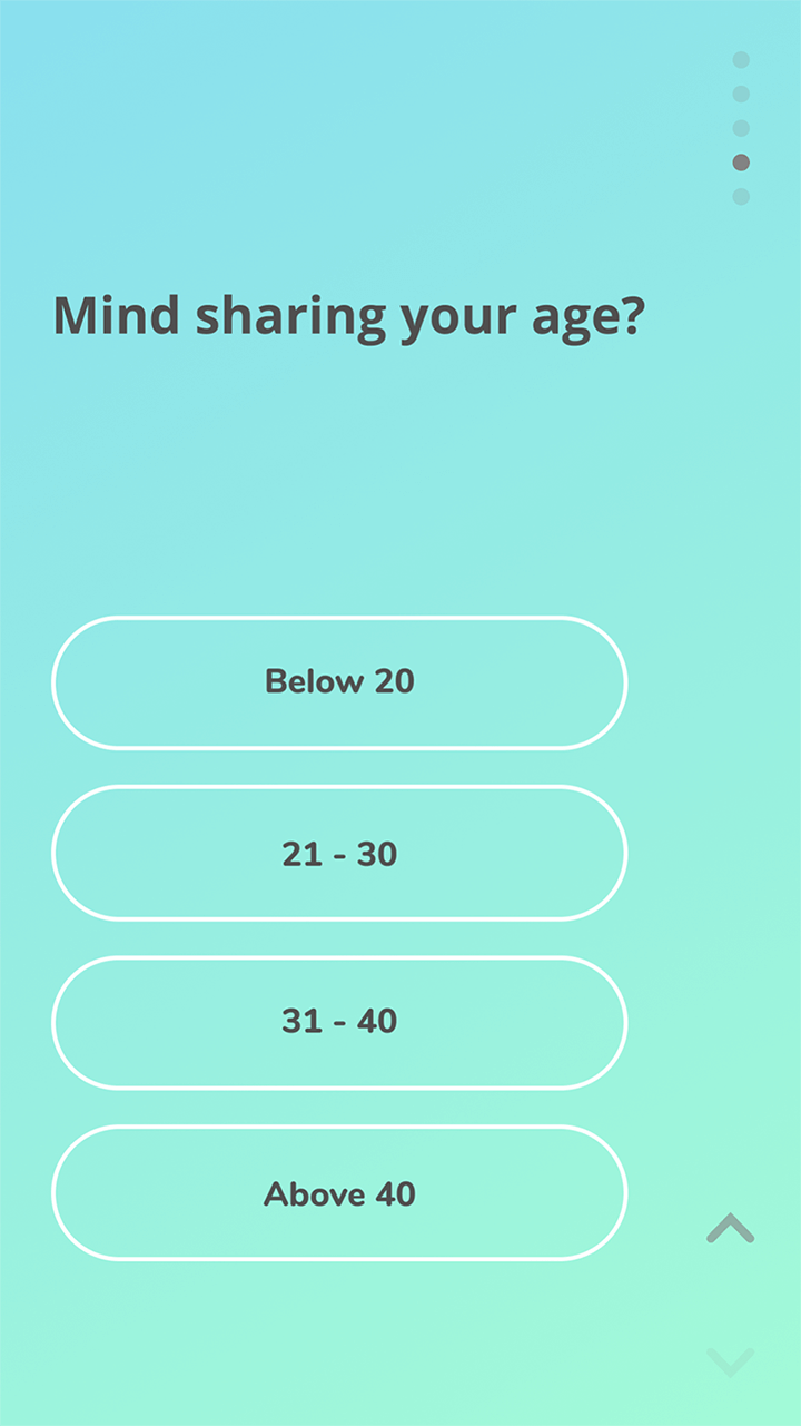
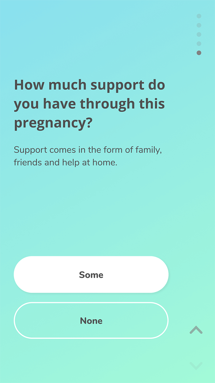
The set-up will help to tailor content base on:
Interviewees felt that these factors significantly impact the type of content mothers seek. They also provide context for the analysis of the moods and symptoms tracked in the app.
We offered brief questions for mothers to record their well-being on the go, which included:
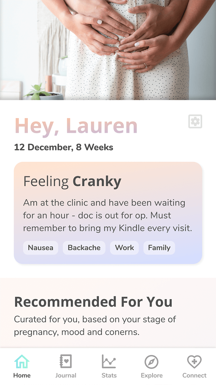
The screens for mood tracking, in particular, would change colour according to the answer. If a mother does not use the tracker, the app can still provide content based on her registered profile.
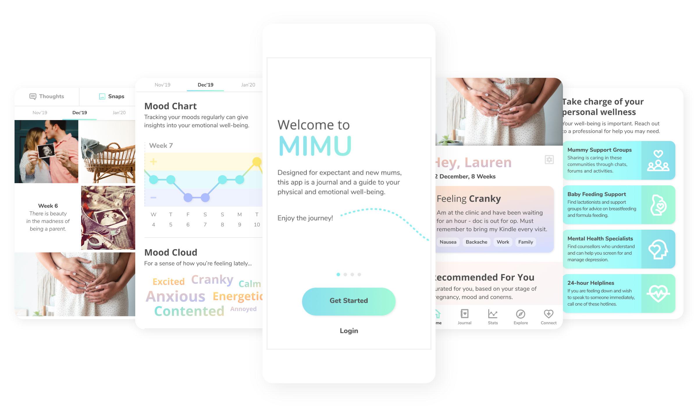
The content on the home page is brief so as not to overwhelm mothers, which was a common stress point for interviewees.
Mothers can scroll through their penned thoughts to reflect on their journey. They can export or archive their writings to consult a specialist if required.
Interviewees were excited about the image gallery, lamenting that they have been able to document their journey so neatly. It not only serves to preserve their pregnancy journey but also encourages them to use the app regularly.
Mothers can scroll the mood chart to view their weekly ups and downs; or capture their moods in the mood cloud, which our interviewees liked.
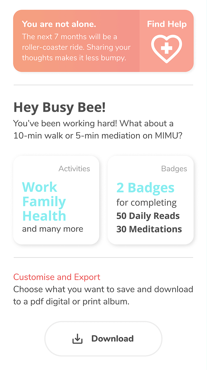
We introduced beautiful postcard-like badges to collect to motivate mothers to browse the tailored content regularly.
Mothers may download their tracked data to consult profesionals.
We placed quotes throughout the app, which interviewees felt was comforting.
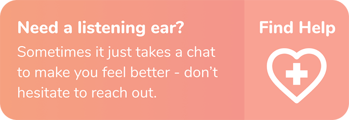
The button appears when the app detects long periods of heavy emotions, guiding mothers to seek support. It is coloured strategically in peach, different from the usual calming tones on the app.
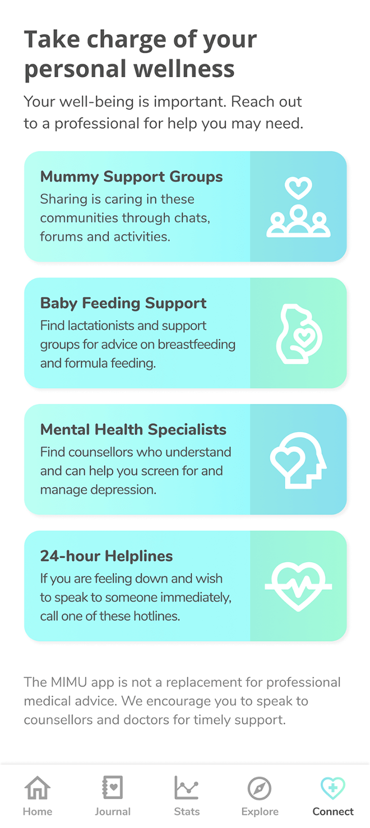
Mothers can reach out to support groups and healthcare professionals on concerns such as depression and breastfeeding. We formulated these through discussions with interviewees. Ideally, we seek to consult medical professionals to provide more comprehensive support.
We used semantic differential scales to measure where our app stood when testing it with five mothers and applied affinity mapping to gather the insights we needed to improve the app.
The mothers felt that the prototype was friendly and inviting. They were pleased to see all features integrated into one app. The proof of concept met their needs and provided a solid foundation to build on.
As the app was considerably distinct from what is available in the market, interviewees needed some guidance to use it. With the aid of semantic differential scales, we received constructive feedback to make the app more intuitive.
The process was too simple and raised privacy concerns. We introduced the app features and privacy terms with more detail, thereby providing better assurance and understanding to use the app.
The age of mothers and the level of social support they receive bring about differing challenges. Several mothers feedbacked that these factors may help to tailor the app experience even more.
Some interviewees were unsure why it was necessary to record their moods and symptoms. We reworked the copywriting to clarify ambiguities and streamline the recording process for the tracker.
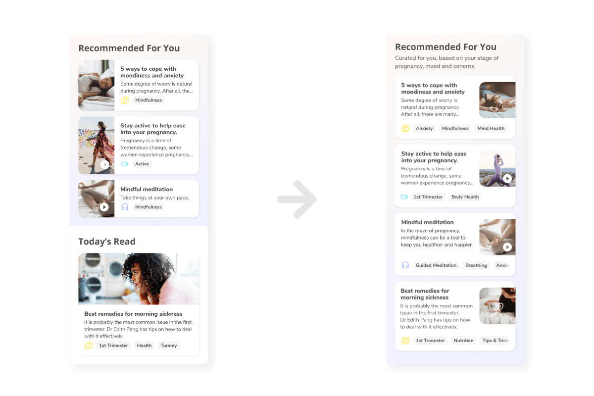
Interviewees were confused by "Today's Read", which looked different from the list of tailored content, prompting us to simplify the list.
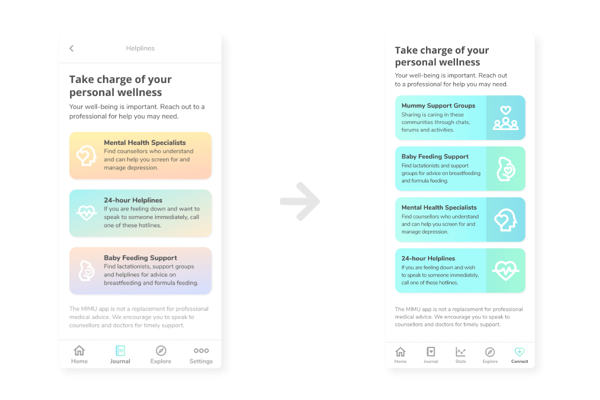
Interviewees felt that the statistical tracking of moods and symptoms was too clinical to be placed in the journal section and wanted to locate it more easily. Hence, we provided access via the main navigation.
The helpline was another feature that was difficult to reach, especially since the prompt card appeared unclickable. We redesigned it to look more like a button and included it on the main navigation.
We developed the tracker based on the assumptions and feedback from our interviewees. We need medical expertise to advise what the app should track for mothers to reap the most from service.
Regular use impacts the tailoring of content and reporting of well-being. We were unable to draw conclusive results from interviewees as they indicated varying frequencies of use. We need to survey a larger pool of mothers to learn how to engage them more regularly on the app.
We spent significant time deciphering what to track in the app without the expertise to confirm. Once we tested our proof of concept with interviewees, we realised that they were our best consultants. It was heartening that our clients and interviewees sincerely felt that the app would have helped them during their pregnancy. I am very grateful for the opportunity to participate in this meaningful project.