User Interviews, Affinity Mapping, Content Audit, Comparative Analysis, Card Sorting, Tree Testing, Information Architecture, Usability Testing, Wireframing, Prototyping, Responsive Design
User Research, Analyst, Strategist, UI designer
Figma, Optimal Workshop
2 weeks
Marco Salazar
Tim Chen
For this two-week project, we focused primarily on these two aspects of the organisation's operations, engaging with users who have donated or volunteered in the past year in our research and testings. Our research questions were as follow:
We carried out the project in three stages, consistently applying the same four tasks across all tests to track improvements in the usability of the home, donate, and volunteer pages.
Donate
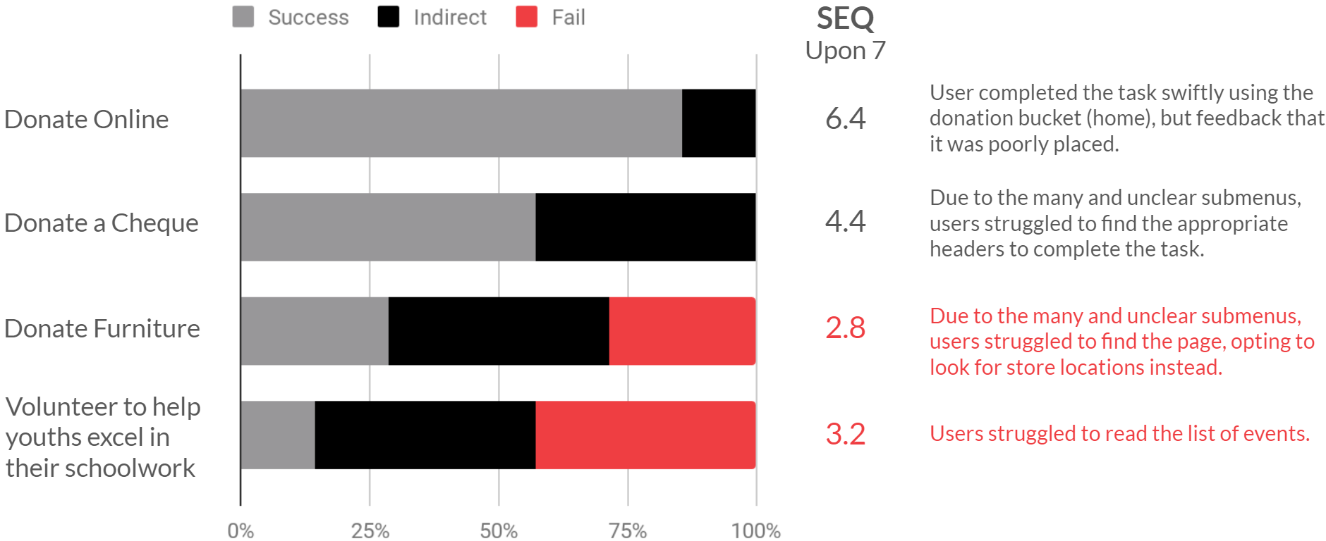
Task 1 Make a donation online.
Task 2 Make a donation through a cheque.
Task 3 Find out how to donate furniture.
Volunteer
Task 4 Find a volunteer opportunity to help youths in their schoolwork.
We quickly realised it was not as simple as it seems to donate and volunteer as there were many ways to do so. The website also had dense information about the organisation and the vast services it provides. The content noticeably required more careful organisation and more obvious labelling.
We had 15 participants sort the content from the audit, reducing the original ten menu items to five broad groupings.
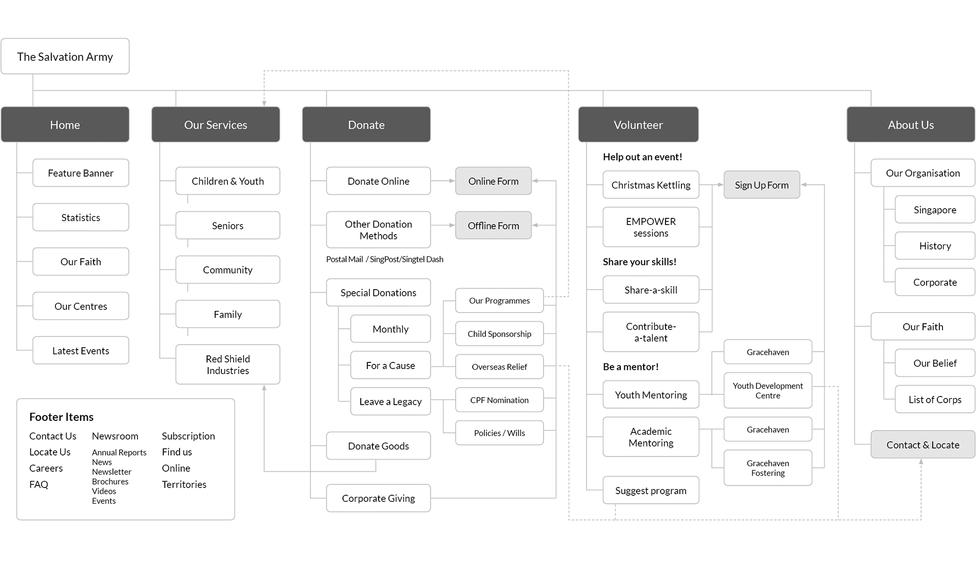
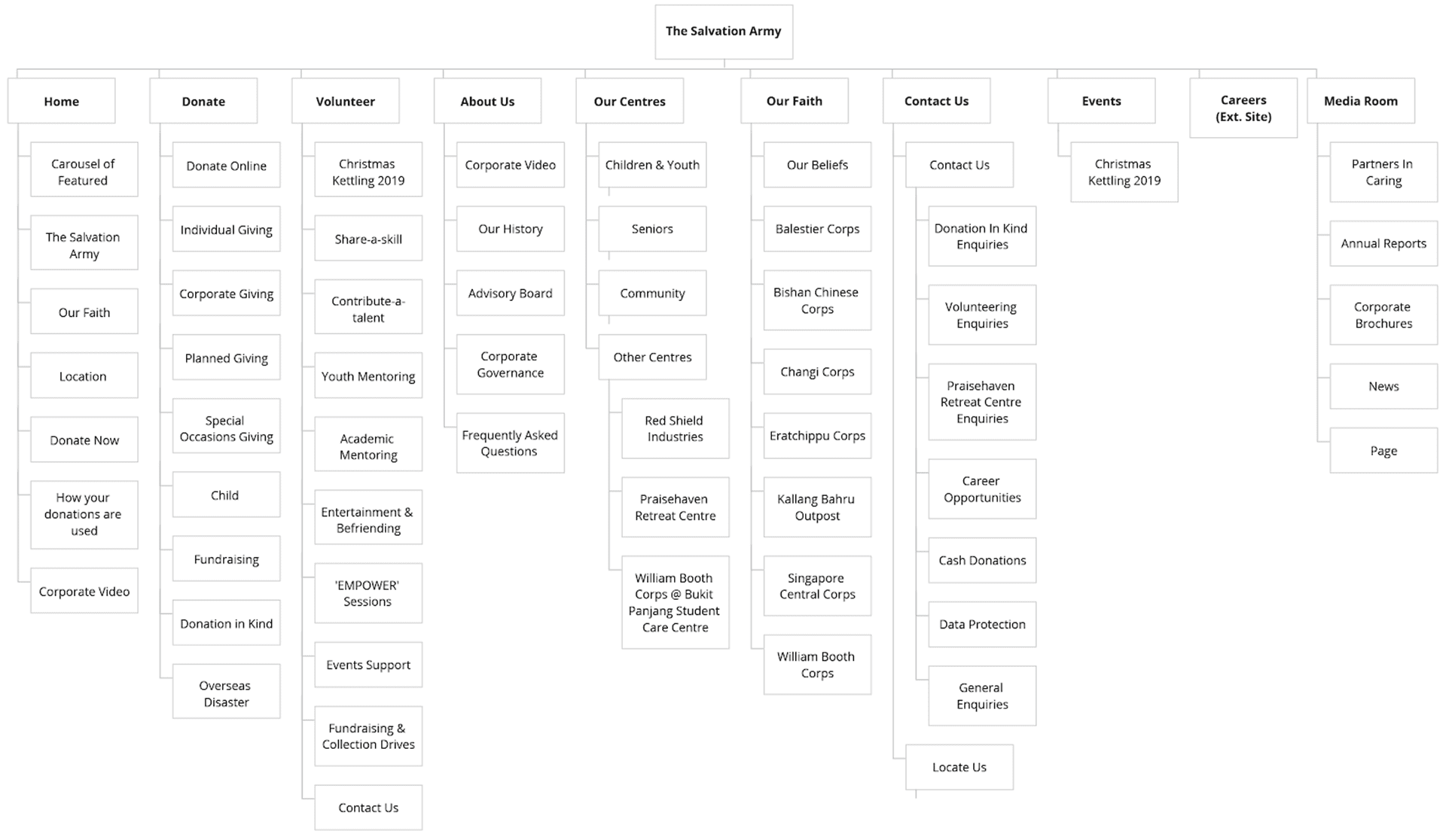
Before: Home, Donate, Volunteer, About Us, Our Centres, Our Faith, Contact Us, Events, Careers, Media Room
After: About, Donate, Volunteer, News, FAQ, Contact
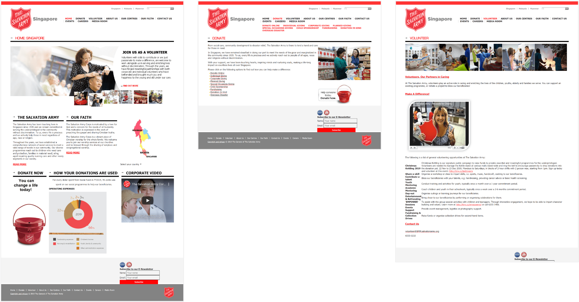
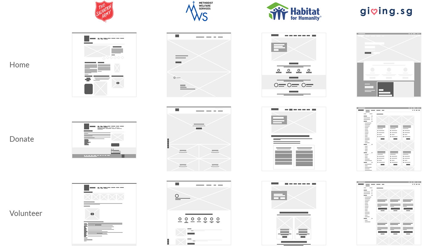
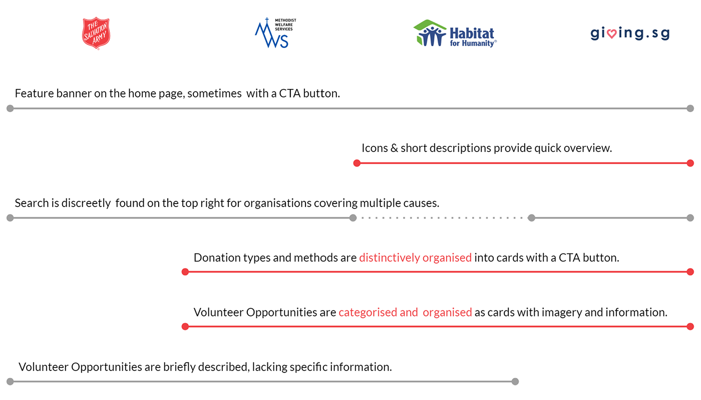
The SA website has similar features as its counterparts, but users cannot find them or face difficulties in using them.
Information on the SA website was strings of running text, whereas other sites used images to support and cards to organise. The lack of organisation and visual cue it less user-friendly.
Websites of other organisations have fewer main navigation menus compared with SA. Their layouts are cleaner and utilise hero images and icons with a clear call to action.
We carried out interviews and usability tests with seven participants to get critical feedback on donating and finding volunteering opportunities. Using affinity mapping to consolidate feedbacks, here were our key findings:
Donors: They want to donate money and goods easily. However, they struggle through the menu and inconsistent layouts to locate the information.
Volunteers: They want to understand the volunteering opportunities available. However, they find that the information was poorly presented.
Applying insights from card sorting and usability testing, we can build a more intuitive IA that is simpler to navigate.
We can learn from other website and use UI design to outline donating and volunteering options more clearly.
From our solution statement, we made two iterations and conducted usability tests accordingly. This section will address the improvements made on the Information Architecture (IA) and User Interface (UI) Design of the website.
There were too many items on the top-level navigation.
The groupings left out the social centres SA serves, which is a vital part of their operations.
We decided to place the social centres on the top-level as "What we do" and added a universal donation button, renaming the donation page as "Ways to give" to differentiate from it. Unfortunately, through tree testing and usability testing, users feedbacked that the labels were obscure and confusing.
We removed the universal donate button and used plainer terms for the labels.
This improved task success across all tasks in the during the usability test.
With the information architecture sorted, we next dwelled into visually organising the website to promptly guide users from the home page to the respective pages they seek. This section summarises the iterations made for the main home, donate and volunteer pages. There were also subpages designed as part of the user experience, which can be viewed in the prototype.
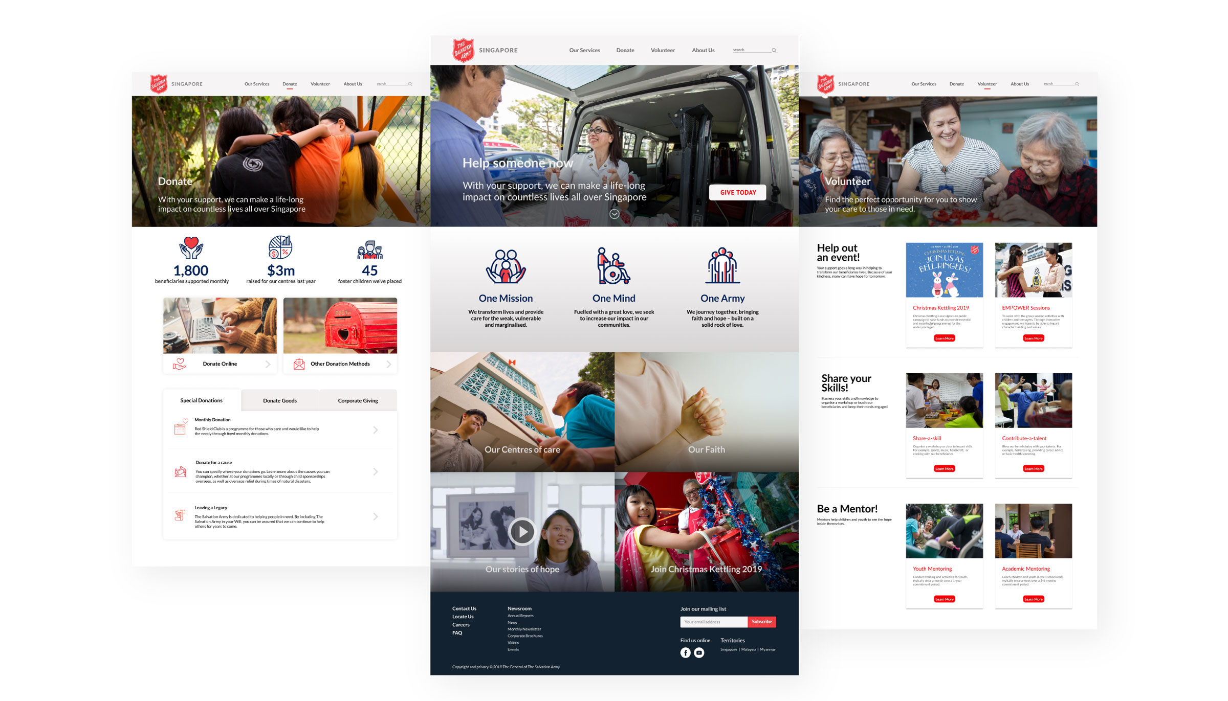
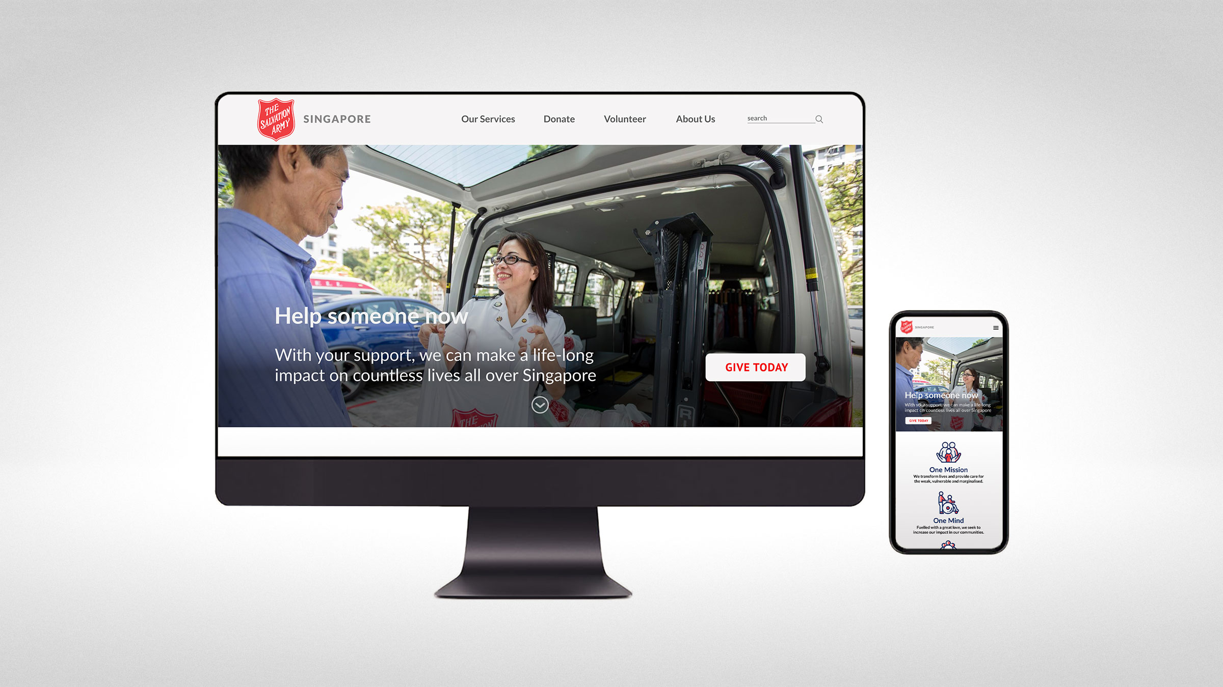
The home page was text-heavy and lacked visual hierarchy. We used images to lead the story in the redesign, shifting text away from the home page so as not to overwhelm users from the get-go.
Users can hover over the image thumbnails to read a short write-up and click to find out more.
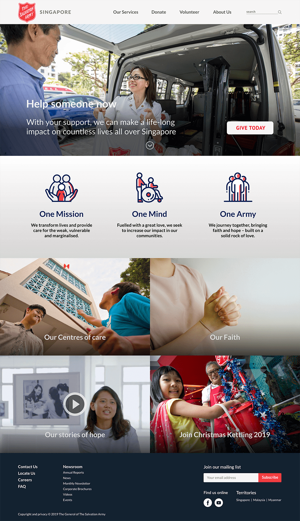
It was previously possible to go directly to the donation form from the home page. In the new IA, users have to go through this page to donate. This route was less direct but made users curious about the various donation methods and the impact of their donations.
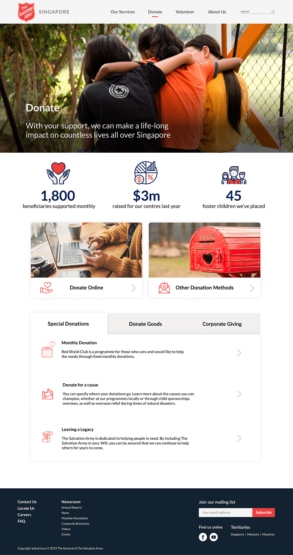
The home page of the existing site had a chart of how donations are used. We noticed participants looking for this information during usability testing and hence we decided to place it on the donate page with eye-catching icons.
There were many options to donate with the SA, listed with no apparent order. Through the content audit, we noticed that some links lead to immediate actions while others required to read through before donating. We gave priority to immediate actions by designing them as image cards and allocating the rest as tabs underneath.
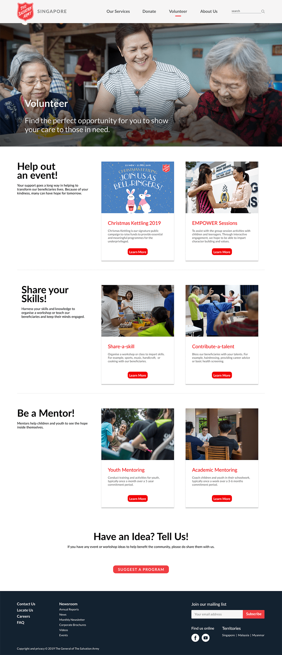
We categorised the opportunities into three: event-based, skills-based, and service-based.
In summary, we were able to improve the usability of the home, donation and volunteer pages of The Salvation Army website. Task success increased with each usability test. SEQ scores for prototype 2 fared better than the original site as well. The dip in SEQ scores between prototype 1 and 2 may be due to the difference in the fidelity as participants were more particular about the content in the second prototype.
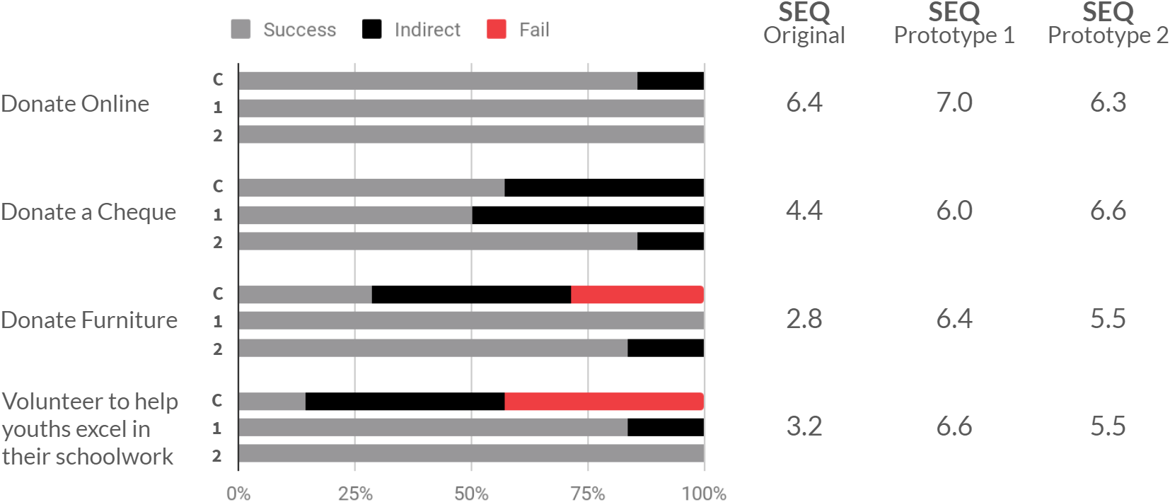
As mentioned above, participants were more particular about the information they read on the website. People who visit similar websites would look for information on the causes, impacts and the background of the organisation before donating or volunteering. On hindsight, it would be helpful to understand their motivations and the information they seek. The insights from which could have set us on an alternative route to redesign the website more intuitively.