Uniqlo 

mobile app

UNIQLO is an innovative global retail brand. However, the same does not ring true for its mobile application. This project aims to evaluate and improve the mobile browsing experience through its navigation.

Methods

User Interviews, Affinity Mapping, Comparative Analysis, Usability Testing, Prototyping

View Prototype
Responsibility

A solo project covering research, design, and testing of prototypes.

Tools

Figma

Duration

1 week

Discover 

— The Pains of Browsing

Goal

Understand user pain points when browsing the app.

Known for its innovative and life-enhancing apparel, UNIQLO surprisingly receives much flak for its mobile application. Technical bugs plague the app and obstruct customers from using it. For those who can use it, one of the frequent complaints is the painful browsing experience.

  • What are the shopping habits of UNIQLO customers?
  • How do they navigate the mobile application?
  • What are their pain points when browsing the app?
Research Methods
  • Interviews
  • Perform usability tests
  • Comparative Analysis
Participants
  • Familiar with e-commerce
  • Familiar with UNIQLO
  • Age 20 - 30s

Problems

Participants did not know how to navigate the app.

Most participants were unsure of where to start. Many were confused toggling between the two navigation systems in the app. More often than not, users did not find the features they were looking for and hacked their way through the tasks during the usability test.

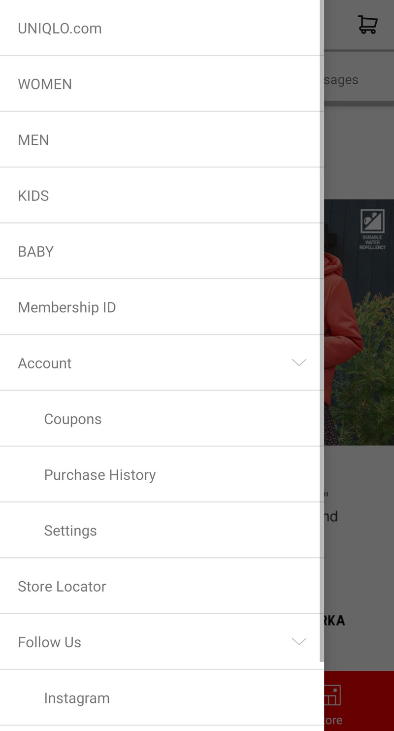
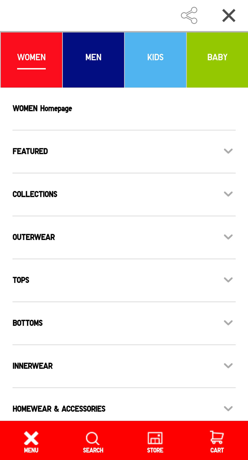
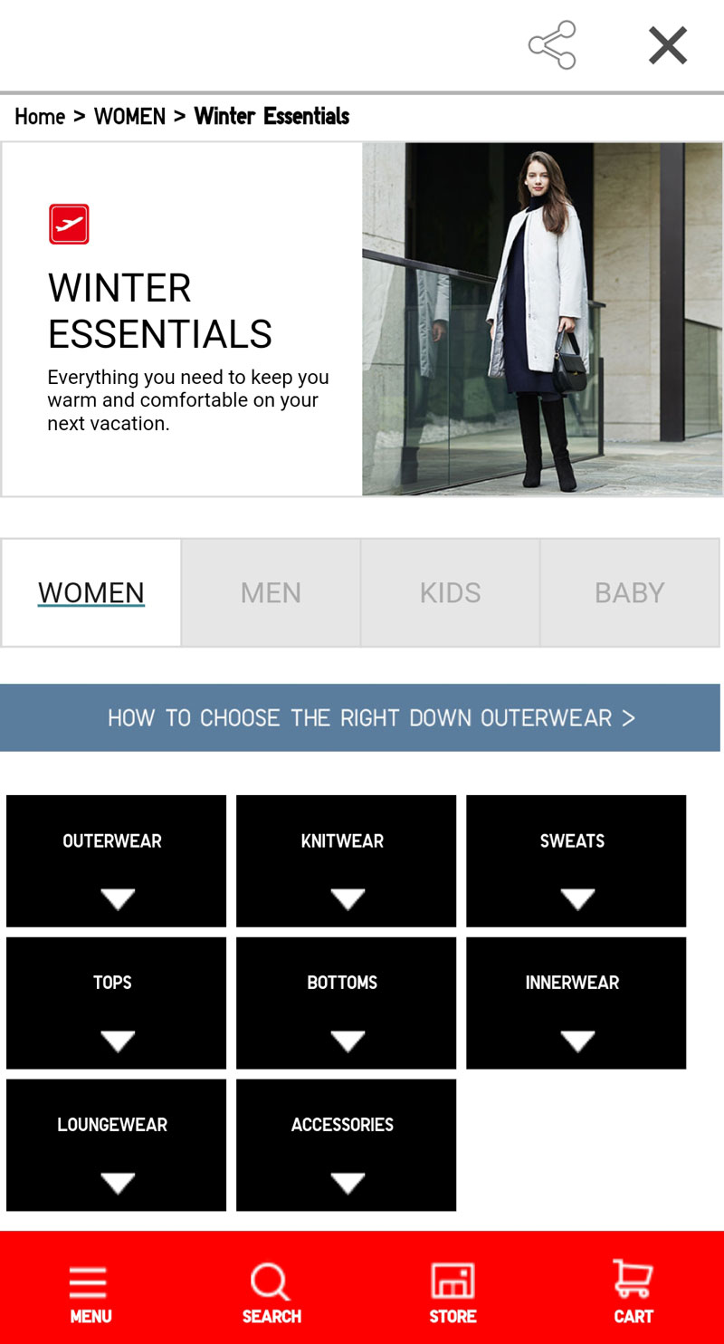
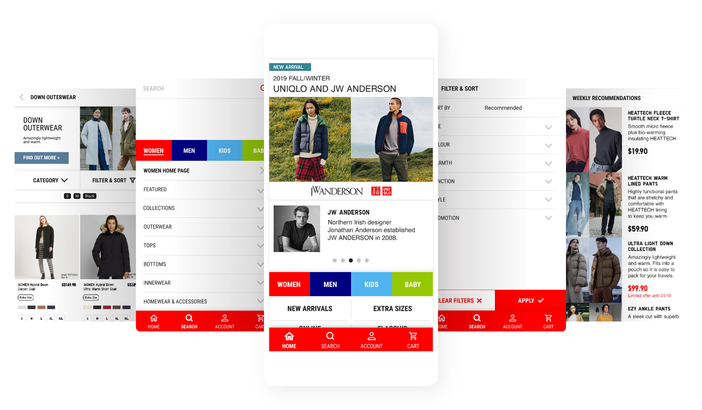
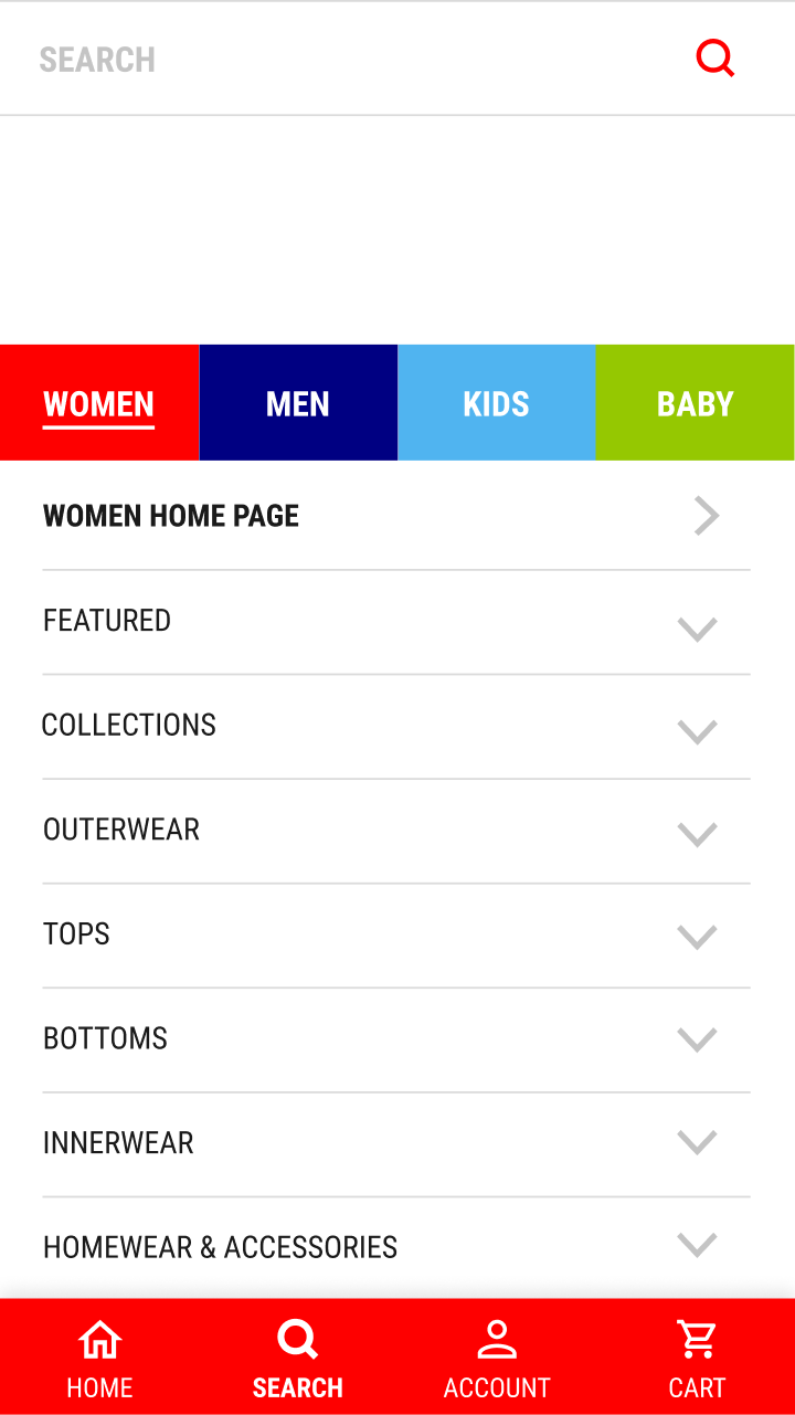
Inconsistent Navigation

The app loads the mobile version of its website, whereby both has its own navigation system. The home pages on both the app and web load the same content, which makes it especially difficult to differentiate the two navigation systems. Both home buttons also open up differently, which disorientated participants.

Apllication Home & Menu
Mobile Site Home & Menu
Messy Search Pathways

There were multiple pathways for participants to browse the app. They could use browse by categories or use the search bar. However, these pathways were inconsistent through the app, appearing and functioning differently. Participants were confused by the multiple search bars, wondering what the hashtags were for and why there were no search suggestions.

Define 

— What's Different

Unique to UNIQLO

UNIQLO Customers need a way to swiftly navigate the app because they already know the products well.

Users have product knowledge.

Most participants just want to browse, and will only bother to find out more after they click into a product. It is part of the reason why they mostly start their search by category.

The product range is manageable.

Filters surprisingly were not as crucial for UNIQLO consumers as the products were not as wide-ranging as other clothing brands. However, users expected it to be present nonetheless.

Comparative Analysis

Consumers have a preconceived understanding.

Since the participants were familiar with e-commerce, they relied on their experience with similar apps to navigate and feedback on the UNIQLO app during the usability test. Based on the apps they used, a more in-depth comparative analysis was conducted to identify standard features and best practices.

Home

Succint and consistent navigation

Search

Search bars are flushed to the top and provides search recommendations

Listings

Large images with minimal colour and sizing details

Filter

Comprehensive filter drawers

Product

Large images come before product description and pricing

Develop 

— A Better Browsing Experience

Prototype

Using categories to lead the browsing experience.

As mentioned above, UNIQLO products are not as wide-ranging as other clothing brands, and their consumers are used to searching through categories. We can streamline the browsing experience by improving the category search feature.

View Prototype

Consistent navigation & search that lead users to browse by categories

  • Single navigation menu
  • Single search channel
  • Consistent category header (Women, Men, Kids, Baby) on both home and search screens
  • Consistent category listing styles
  • Visual emphasis on available categories over manual search

Prominent Filter Tabs

  • Make filters more accessible on the top
  • Two filter options: Categories, and Filter & Sort
  • Rename "Sort By" to "Filter & Sort"
  • Easier application of filters through the drawer
  • Adding UNIQLO tech-specific filter options such as warmth, function and more

Evaluate 

Results

The first usability test was on the existing app, and the second was on the redesigned prototype, as seen above. In summary, participant feedback on the browsing experience improved with the prototype.

Aggregated participant ratings for the existing UNIQLO App (Before), and the redesigned prototype (After)

Reflection

Develope solutions with consideration for technical implementation.

The project was an exercise to understand and improve the usability of apps through a user's perspective. The design solution had no regard for existing infrastructures in the app, which would have rendered the proposal obsolete. Hence, I understand the need to work closely with developers in real scenarios to develop solutions that are worthy for both businesses and their consumers.